
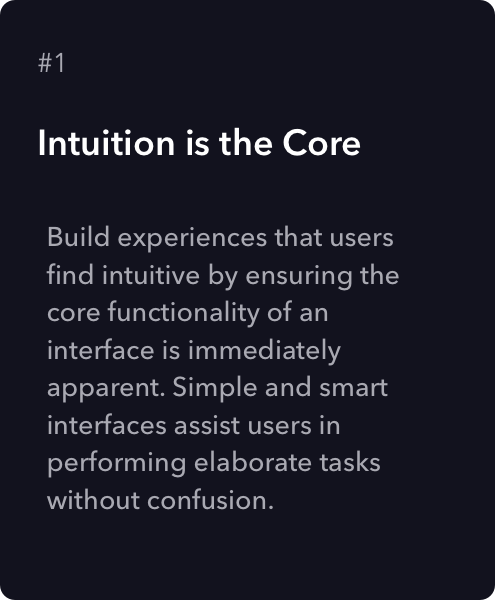
Reimagining space with design system
As one of the founding design leaders at Sprinklr, I joined during its formative phase, when the company was an ambitious startup navigating the complexities of omnichannel customer experience management (CXM). Serving over 1,500 enterprise clients like Amazon, Nike, and Microsoft, Sprinklr’s vision was bold: unify social, marketing, and customer support into a single enterprise platform. My mandate was equally bold—to architect a design foundation capable of scaling across dozens of use cases, while adapting to enterprise complexity, and laying the UX groundwork that could support IPO-scale growth.
From Fragmentation to Foundation: Building a Cohesive Design Language
At the outset, Sprinklr’s UI was a patchwork of features driven by engineering velocity, not design cohesion. I initiated and led the creation of Sprinklr’s first unified design system—codifying design tokens, grid systems, interaction models, and visual hierarchies that enabled consistent UX across 60+ modules.
This wasn’t just a style exercise; it was a strategic enabler. With every new module, the design system accelerated development, reduced cognitive load for users, and established trust across the product suite. It also became a critical enabler for our enterprise clients to feel like they were working within one coherent experience rather than a collection of tools.
The solution - 'Version Update with UI Redesign'
Addressing the Problem
Our team quickly set out to tackle the problem in a unique way, where we researched different design systems and drew inspiration. We were motivated by Google's Material Design System, Apple's Human Interface Guidelines, and Salesforce's Lightning Design System at that time.

Introducing Space Design System
Driven by the need for clarity and cohesion in a rapidly evolving product ecosystem, we developed our own design system—'Space'—a foundational framework inspired by the Chaos Theory and the Butterfly Effect. Every element of Space was crafted with intention, balancing minimalism and precision to deliver a refined user experience. Guided by Sprinklr's core values and informed by rigorous usability testing, we applied design thinking methodologies to reimagine the platform for complex enterprise use-cases—always placing customer needs and clarity at the center of every decision.
The Design Philosophy
Crafted the design language to guide users through an intentional emotional arc beginning with Admiration, deepening into Gratitude, and culminating in Love. For the Sprinklr experience, our goal wasn’t just usability, it was to make enterprise software emotionally resonant. We aimed to create tools that empowered users by simplifying complexity, offering clarity, and delivering delight at every interaction. The core emotional checkpoints we aimed to evoke in users.
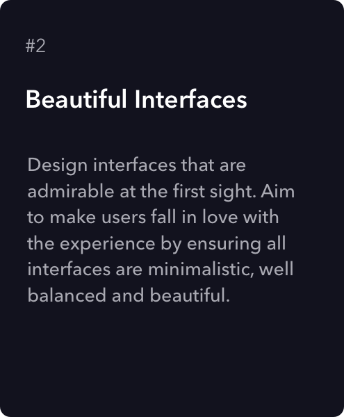
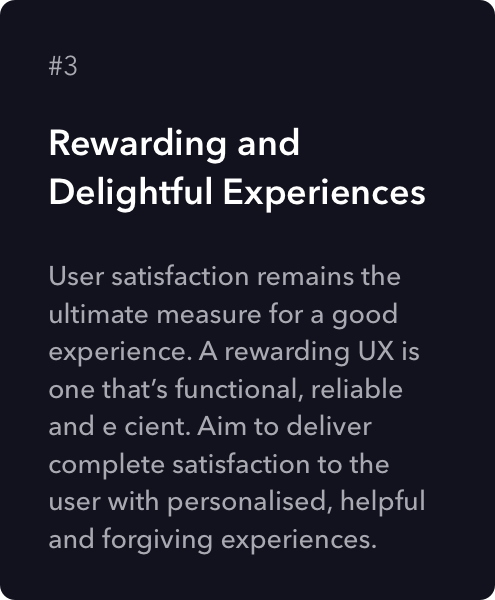
The Three Pillars
The Design Architecture
This Space Design system was largely inspired on the principles of the Atomic Design Theory by Brad Frost. The key idea behind this methodology being small, independent - atomic - parts, can be combined into larger molecular structures.
This foundation loosely defined our typography, colors, icons, spacing, navigation and information architecture. This inturn helped us shape our visual guidelines of our work in a unified direction.
We divided our entire UI elements based on the atomic theory, this helped us to easily classify the components for re-usability and consistency.
The building blocks
Templates
Pages
Pages are the most concrete stage of atomic design that apply real content to templates and articulate variations to demonstrate the final UI and test the resiliency of the design system.
Grids
The smallest scale on the grid chosen was 8x8 px. The entire DNA of the structure was in multiples of 8.
Colors
After a lot of trials and usability testing on the contrasts we came up with the following color palette.
Iconography
Using the IOS Golden Ratio template, all the icons were crafted with visual harmony.
Typography
Spearheading usability testing for typography and visual hierarchy, I conducted extensive user testing sessions to evaluate readability across a variety of user roles and devices. I stress-tested font choices under real-world conditions—including long-form content, data-heavy tables, and dynamic dashboards—ensuring optimal performance in enterprise environments. Through this rigorous evaluation, we ultimately adopted ‘Neue Frutiger’ for its clarity, versatility, and superior on-screen legibility. After iterative testing, we adopted ‘Neue Frutiger’ as the core typeface for its readability and performance across geographies. The conscious decision was based on the following parameters.
High Legibility and Readability
Large Character set
Language Support
Variety of Weights
Being a Webfont
UI Components / Molecules
All the UI components or molecules were formulated for re-use into a single design template resource file.
Voice and Tone of Sprinklr
I collaborated closely with Product Marketing and Documentation to shape Sprinklr’s voice and tone. I developed principles for:
Empathetic language that guides users through complex workflows
Clear, concise UX copy aligned with user context
A tone that positions Sprinklr as a "Lovable Guide"—smart, honest, caring, and optimistic
When writing, we want to take our users through the journey of Admiration, Gratitude, and finally Love.
Tone of Sprinklr
Sprinklr as a "Lovable Guide" is
smart but not overwhelming
focused but not streamlined
caring but not overbearing
forgiving but not powerless
optimistic but not misleading
honest but not impolite
fun but not silly
Design Spec
Pre-Zeplin, Pre-Figma Design Specs – My Process at Sprinklr
Before automated spec-generation tools, I was responsible for producing pixel-perfect documentation manually to ensure that engineering could translate design into code with minimal ambiguity. Here's how I approached it:
1. Detailed Redlining in Sketch or Illustrator
I used Sketch (and at times Adobe Illustrator) to create design mockups, then overlaid redlines and annotations manually:
Spacing, padding, and margins were marked using guides and callouts.
Font styles, sizes, and weights were explicitly labeled.
Hex codes and brand color references were documented per element.
Every interactive element (hover states, disabled states, active) was visually detailed.
2. Component Specification Sheets
To scale consistency:
I maintained a centralized PDF of core UI components (buttons, inputs, modals, etc.), including usage guidelines and code references.
These sheets were version-controlled via shared folders (Dropbox, then Google Drive).
3. Design-to-Dev Syncs
Without real-time spec syncing:
I led weekly or bi-weekly walkthroughs with engineers to go over flows.
Annotated PDFs or exported image slices were sent along with verbal clarifications to reduce interpretation errors.
Any updates to design were tracked via changelogs in shared documentation.
4. Stress Testing & Responsive States
For adaptive layout specs:
I created mockups for various breakpoints (mobile/tablet/desktop).
Stress-tested content-heavy views to ensure components held up under real data.
Annotated alternate states to help devs build elastic UI logic—not just fixed templates.
5. Design QA
After development, I actively QA’d the implementation:
Compared staging builds to the redlined mocks.
Filed visual bugs and worked closely with engineers to fine-tune layouts.
Final Outcome
An aesthetically captivating and consistent experience for content marketers with the new design system.