Rewards 3.0
Doubled Revenue in 3 Months by Rethinking the Redemption Experience
Overview
To unlock the untapped potential of Miles’ Rewards product line, I led a full redesign focused on increasing relevance, simplifying discovery, and improving user delight. With a rigorous research-driven process, we achieved a 2x revenue increase in just three months.
🎯 Situation
Despite high app traffic, the Rewards section wasn’t converting well. Leadership prioritized it as a growth lever, tasking us to transform it into a high-performing revenue engine.
🛠️ My Role
I owned the end-to-end design process — from research and concept development to delivery — working closely with sales, product, and engineering to align business goals with real user needs.
How did we solve the discoverability of relevant rewards for our users?
Design Process
Understanding the Problem
User Research
Competitor Analysis
Product Analytics
Hypothesis / Risks
Design Concepts
Testing
1. Understanding the Problem
I started by triangulating quantitative and qualitative data to surface core friction points in the rewards experience.
What We Knew (from Product Analytics)?
Long time to redemption
Not relevant rewards that did not appeal the vast majority of the users
Low conversion from search
What We Didn’t Know?
Why did discovery feel frustrating?
What do users expect when redeeming?
Which factors drove purchase decisions (e.g., brand, price, proximity)
Previous Design
The funnel numbers
Conversion: 30.2 %
Medium time to convert: 2m 49s
2. User Research & Affinity Mapping
🧠 1,204 User Survey Results:
78% said rewards felt “not relevant enough”
61% found it “hard to browse”
50% wanted more brand variety
47% expected faster access to time-sensitive rewards
👱🏽 20 In-Depth 1:1 Interviews with Power Users:
Using affinity mapping, I grouped recurring insights into themes:
Theme
Relevancy
Navigation
Brand Value
Time & Proximity
User Quotes & Patterns
“I wish it knew I buy pet food every month”
“I hate diving deep into categories to find anything”
“I only care if it’s a brand I trust”
“If I see a deal nearby, I’ll go grab it”
Design Implication
Personalize based on past app activity
Flatten the IA and reduce discovery steps
Prioritize known/popular brands
Introduce nearby/contextual rewards
These insights helped me reframe the problem:
“As a need-based buyer using the Miles app, I want to find relevant rewards quickly, so I can redeem offers that fit my everyday needs.”
3. Concept Development & Prototypes
I explored 4 IA and layout models:
Concept A: Reward Types as Sections
-
This layout grouped content by sub-type (e.g., Rewards, Raffles, Donations, Gift Cards) as separate horizontal sections stacked vertically. Each section highlighted top picks for that category.
Strengths:
Clear organization aligned with mental models
Users could quickly scan across sub-types in a single scroll
Easy to spotlight limited-time or seasonal offers within each type
Limitations:
Deep scrolling was required to reach certain types (e.g., Gift Cards at the bottom)
No personalization — same layout for all users
Sub-type boundaries felt rigid for users with mixed intent
Concept B: Explore as a Sub-Tab
-
Split the experience into two tabs — My Rewards and Explore. My Rewards showed saved or frequently accessed rewards, while Explore offered a full catalog, filterable by sub-type.
Strengths:
Clean division between personal and general exploration
Ideal for curious users who want to browse by type (e.g., just raffles)
Limitations:
More steps to reach popular rewards (extra tab + filter)
Users were unsure which tab to start from
High cognitive switching cost between tabs and filters
Concept C: Mixed Bag (🏆 Final Winner)
-
All reward sub-types were interwoven in a smart feed, showing a personalized mix of Rewards, Raffles, Donations, and Gift Cards based on user activity, preferences, and engagement history.
Strengths:
Prioritized relevancy over structure — great for need-based shoppers
Sub-types appeared in contextually meaningful ways (e.g., nearby donation drives or trending raffles)
Adapted to user behavior in real time
Limitations:
Complex logic is required to blend different sub-types fluidly
Needed fallback logic for cold-start users
Required clear visual cues to distinguish sub-type cards
Concept D: Sub-Tabs for Reward Types
-
Top-level tabs allowed users to toggle directly between Rewards, Raffles, Donations, and Gift Cards, each with its own dedicated view and sorting logic.
Strengths:
Gave power users precise control to dive into a specific type
Easy to isolate high-performing sections like Raffles or Gift Cards
Scalable as new sub-types emerged
Limitations:
Discovery suffered — some users never switched tabs
Redundant content between tabs led to missed opportunities
Felt more siloed than unified
User Testing
Users picked Option C based on
Familiarity with designs
Clear information architecture
A faster way to reach the desired outcome
Final Production
Ready Design
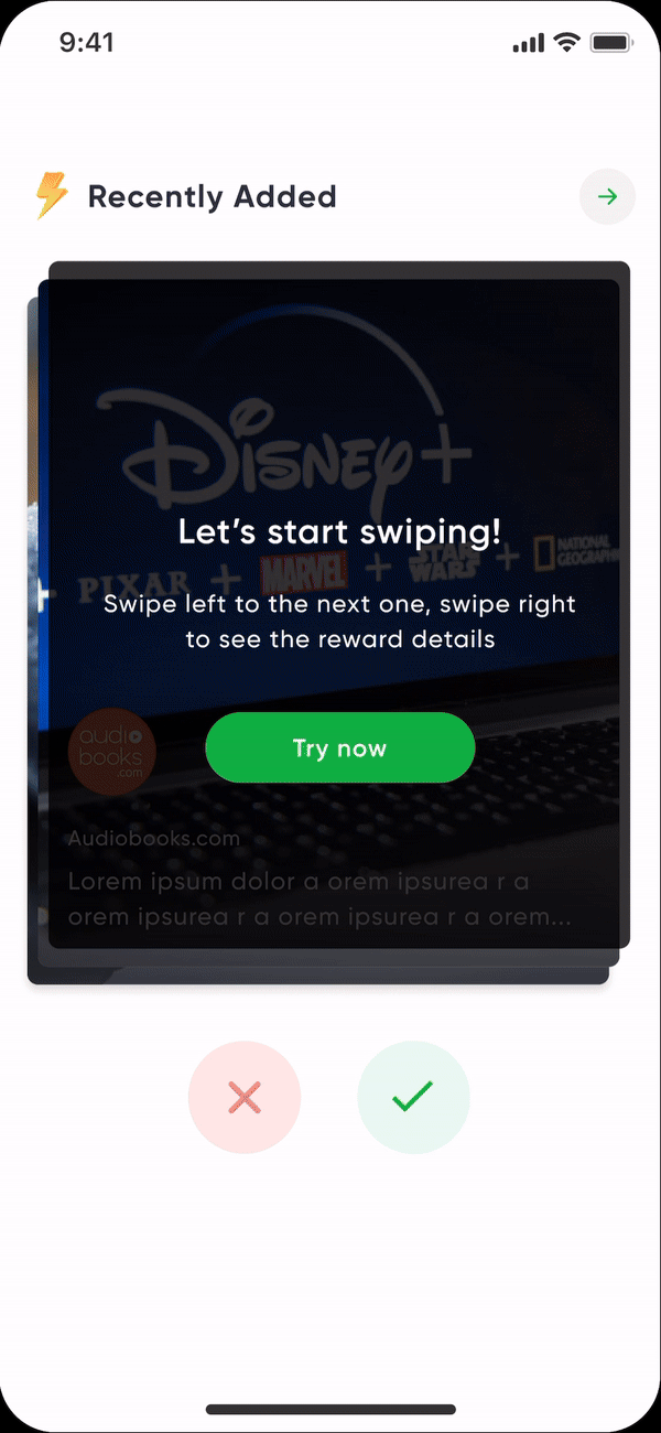
Recently Added with Swipe
Brand new swipe engagement gesture to interact with recently added rewards.
Smart Recommendations:
Driven by app usage, redemptions, and category interest
Reward Stories
Brand new reward stories section that narrates a story about new exploratory rewards.
Nearby Rewards
Geo-targeted cards showing rewards close to the user
A/B Tests
After talking to the stakeholders, we decided to do a slow rollout and to A/B test the new design’s performance
Conversions: 30.2%
Medium time to convert: 2m 49s
Conversions: 35.4%
Medium time to convert: 2m 12s
Impact
Revenue from Rewards - 2x increase
Time to Conversion - ↓ 29.3%
Redemptions per Active User - ↑ significantly
Customer Satisfaction on Rewards- ↑ noticeable lift
Support Tickets (Reward Discovery) ↓ 35%
🧩 Challenges & How I Solved Them
Adoption Concerns:
→ Rolled out changes gradually with guided onboardingUsability Risks of New Patterns:
→ Ran extensive internal testing and iterated based on feedbackMaintaining Design System Integrity:
→ Peer-reviewed all components and ensured consistency with shared tokens and componentsHandling Edge Cases:
→ Partnered with engineering early to model fallback logic and flexible data handling
✅ Business Goals Delivered
📈 Revenue Uplift
⚙️ Scalable Architecture for Future Expansion
📱 Higher User Engagement via Personalization